Everything about how your form looks lives in the Design tab at the top of the builder. It has three parts: Skin (the layout and interaction style), Style (themes, colors, fonts, background), and Add-ons (trust widgets). Changes save automatically and show on the canvas as you make them; use the desktop, tablet, and phone toggles above the canvas to check each size.
A skin is the overall layout. Pick one under Skin; your questions, logic, and endings stay the same.
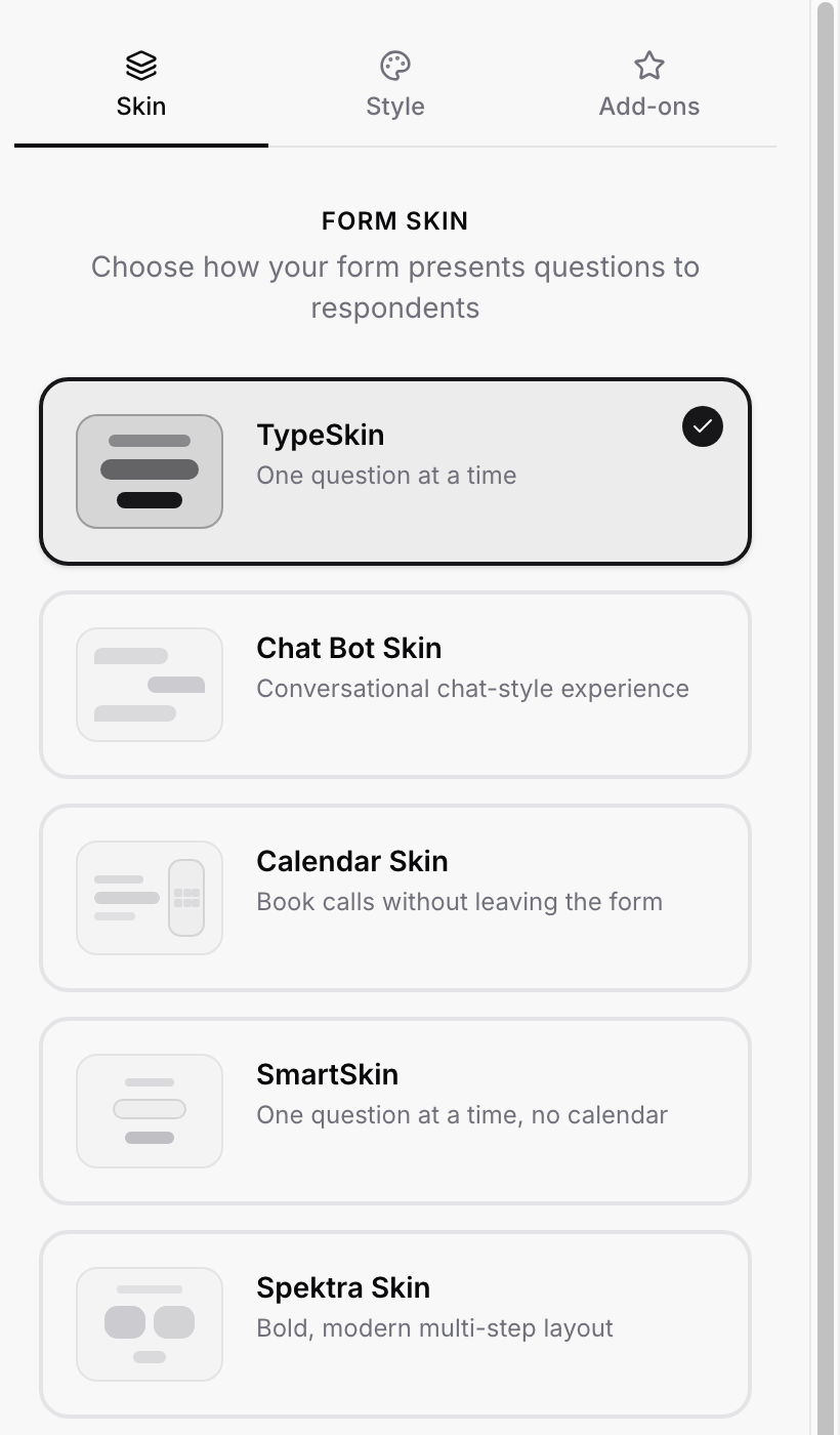
TypeSkin: one question at a time, the classic full-screen flow. The default.
Chat Bot Skin: a conversational, chat-style experience.
Calendar Skin: built around booking a call without leaving the form.
SmartSkin: one question at a time in a compact card, without a calendar.
Spektra Skin: a bold, modern multi-step layout.
Calendar and Chat Bot have their own walkthroughs: Calendar Form Skin and Chat Bot Form Skin. Card-style skins (SmartSkin and the chat bot) float on the page when embedded, which is why their embed background is always transparent.
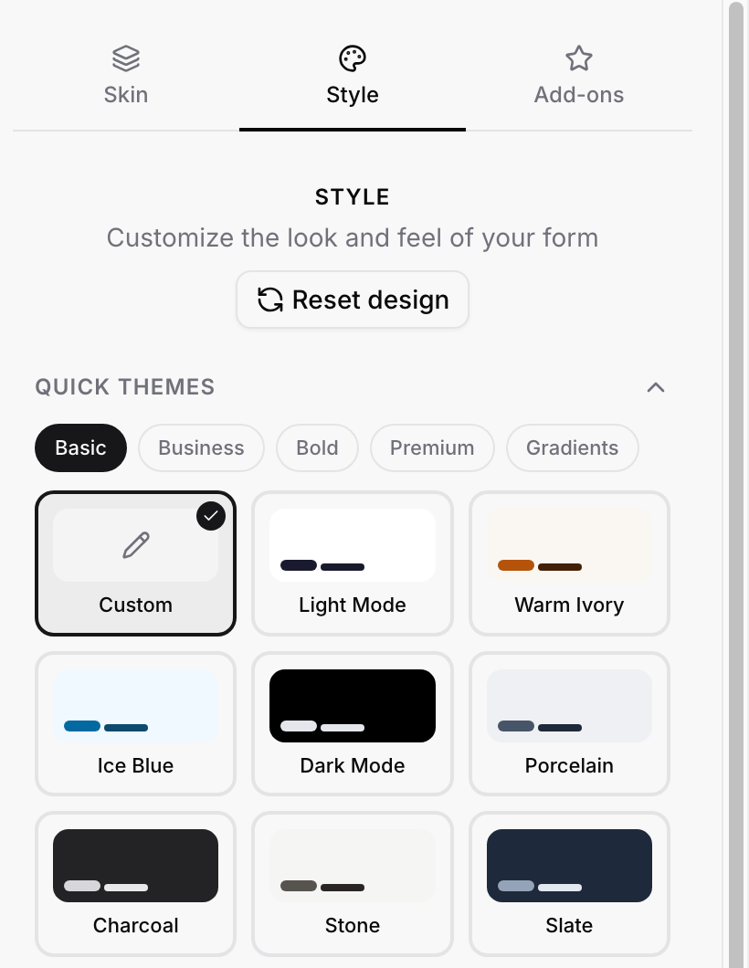
The fastest way to a good-looking form. Under Quick Themes, browse the Basic, Business, Bold, Premium, and Gradients groups and click a theme (Light Mode, Dark Mode, Warm Ivory, Ice Blue, Slate, and many more). A theme sets all colors and the background at once; the moment you edit any color by hand, the selection switches to Custom. The same themes are available on every skin.
Reset design at the top puts everything in the Style tab back to the defaults. It asks you to confirm first.
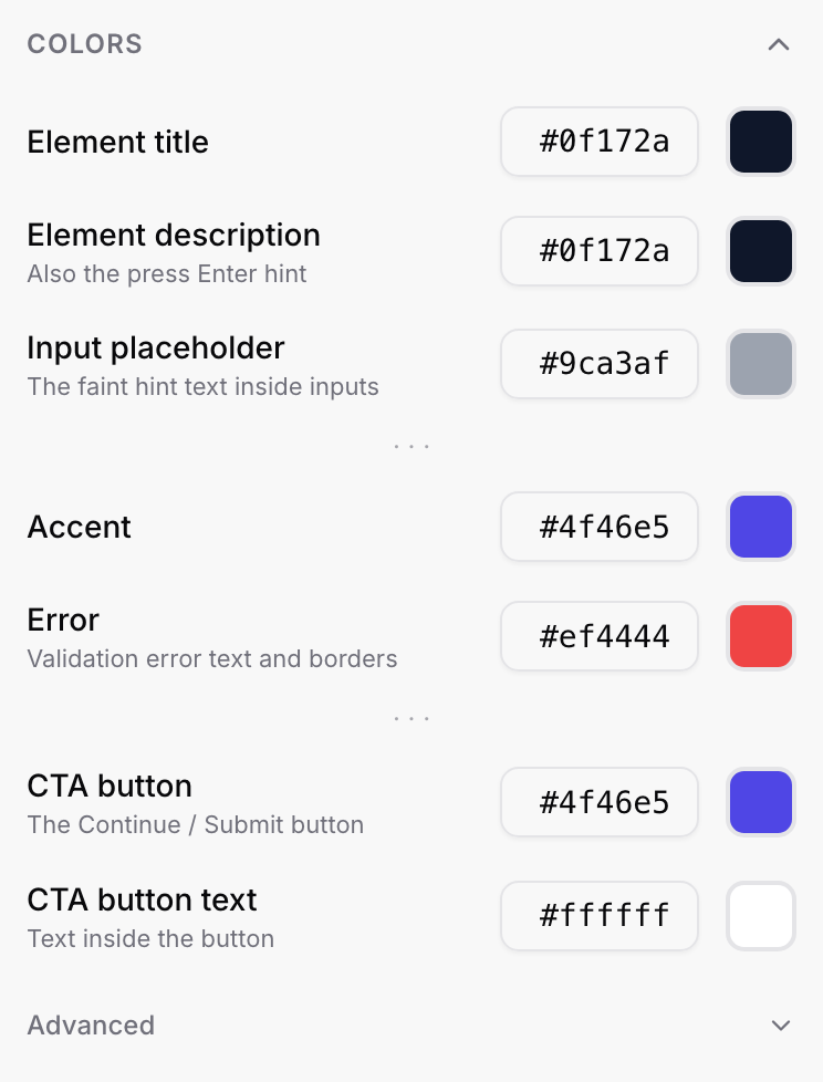
Open Colors to fine-tune. Each row has a hex field and a color swatch; type a hex code or click the swatch to pick.
Element title and Element description (the description color also applies to the "press Enter" hint)
Input placeholder: the faint hint text inside inputs
Accent: selected options, focus lines, and other highlights
Error: validation error text and borders
CTA button and CTA button text: the Continue / Submit button and its label
Advanced: extra controls for input backgrounds, borders, and other details when you need pixel-level control
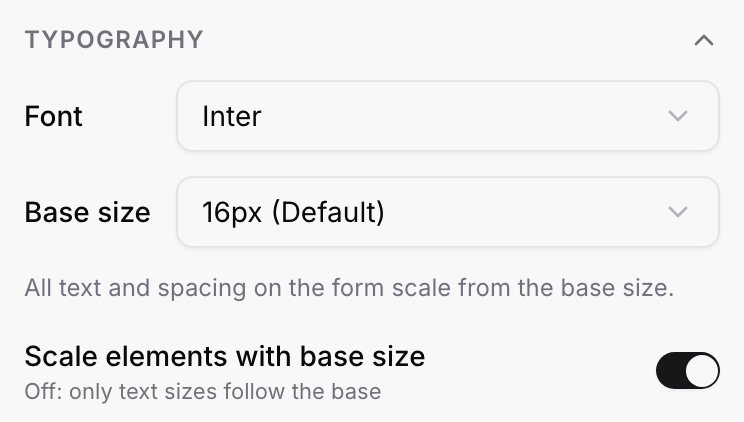
Font: the typeface for the whole form (Inter by default).
Base size: 16px by default. All text and spacing on the form scale from it, so one change makes the whole form larger or smaller.
Scale elements with base size: on, the buttons, inputs, and spacing grow with the base size; off, only the text does.
Need one question bigger or smaller than the rest? Select it on the canvas and use the text toolbar; a per-question size overrides the base.
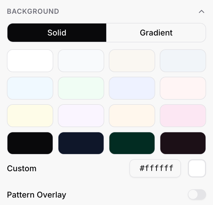
Choose Solid and pick a preset swatch or type a Custom hex, or choose Gradient for a two-color blend. Pattern Overlay adds a subtle texture on top. On an embedded form you can also let the host page's own background show through instead; see Embed Settings.
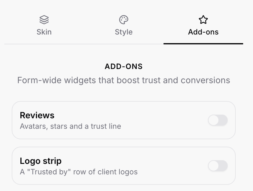
Form-wide widgets that boost trust: Reviews (avatars, stars, and a trust line) and Logo strip (a "Trusted by" row of client logos). Switch one on, fill in its content, and it appears on every step of the form.
Styling is per form. Duplicate a styled form to reuse its look for the next one.
The builder canvas is a close preview, not the final render; check the live form (Share → Link) on a phone before launching.
The small ROASForm badge on the form can be removed on paid plans: How to Remove the ROASForm Badge.

