Most "the form is too big", "too small", "too cramped", or "there's a huge gap" questions come down to three controls, and which one you want depends on whether you mean the form itself or the space around it when it's embedded. This article covers all three.
There is no single "padding" slider. Instead you have a density control that scales the whole form, width controls per skin, and embed sizing that decides how tightly the box hugs the form on your page.
Make everything bigger or smaller: Base size
Text only, or text and spacing together
Make the form wider or narrower: Widget Size
Close the gap around an embedded form
Colors, fonts, and themes
Every text and spacing value on the form is derived from one number, so you resize the whole form by changing that number rather than editing pieces.
Open the form and go to the Design tab.
Open the Style panel (the tab next to Skin).
Expand Typography.
Set Base size — the presets run from 10px up to 64px, and 16px is the default.
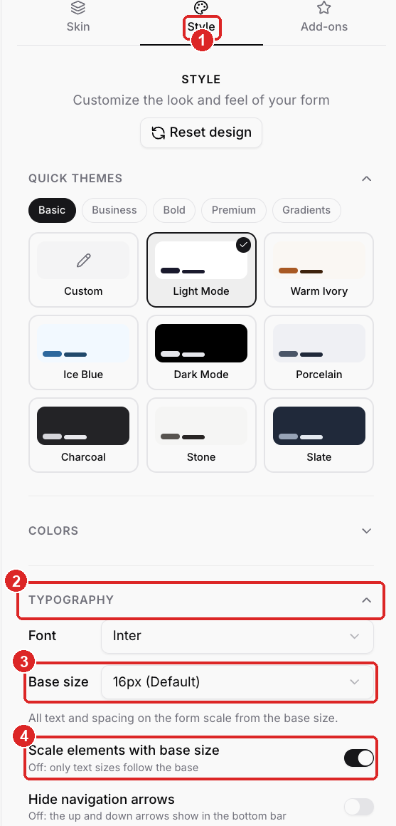
Style — the panel next to Skin, where all look-and-feel lives
Typography — expand it to reach the sizing controls
Base size — one number that drives the whole form's text and spacing
Scale elements with base size — whether spacing follows the base, or only text does
A smaller base size is how you make a form feel more compact; a larger one is how you make it fill more of the page. Everything stays in proportion because it's all derived from this one value.
Right under Base size is Scale elements with base size, and it decides what the base size actually moves:
On — text *and* spacing, padding, and controls all scale together. A smaller base gives you a genuinely tighter, more compact form. This is what you want when the complaint is "too much space".
Off — only the text scales. Spacing and control sizes stay at the default (16px) layout. Use this when you want bigger or smaller type without changing how roomy the form feels.

Question text and answer text are not the same size, and that isn't a bug. They're fixed proportions of the base: the question sits a little smaller than the answer you type or pick. Changing Base size scales both of them together. There is no separate control for "make the question match the answer."
On TypeSkin, the bottom bar has arrows for stepping back and forward. To remove them:
Design → Style → Typography.
Turn on Hide navigation arrows.
The same switch is under Design → Skin, labeled Navigation Arrows. With it off, visitors move with OK, Enter, and the keyboard arrows.
Calendar Skin, Chat Bot Skin, SmartSkin, and Spektra Skin don't draw those arrows, so the switch isn't there.
Calendar Skin has no title bar across the top. If you want a headline before the questions, add an Intro element from + Add content → Other → Intro. It shows as its own first screen, then the form begins.
Base size controls scale; width is a separate control, and where it lives depends on the skin:
Chat Bot Skin — Design → Skin → Desktop Size: Small, Medium, or Large. Mobile is always full width.
Calendar Skin and SmartSkin — Design → Skin → Widget Size: Small (compact card), Medium (balanced), or Large (maximum width, best for long forms or a wide calendar).
TypeSkin and Spektra Skin — width is set by the space you give the form: the page column it sits in, or the embed width (below).
A gap or white space *around* the form on your page is almost always the embed, not the form. Two things control it, both under Share → Embed → Customize Embed:
Set Width to Fit to form so the box shrinks to the form's own width instead of stretching across the column. ROASForm trims the side padding on fit-to-form embeds, so there are no leftover gaps or bleed on the edges, including on mobile.
Set Height to Fit to form so the box grows and shrinks with each step. This removes the empty space under a short step — the most common "huge gap below my form" report.
After changing either, click Copy Code and replace the snippet on your page. Embed settings live in the code you copy, not on the form.
See Embed Settings: Size, Transparent Background, Hide Scrollbar, Full Screen for every embed option, and Embed Troubleshooting when something still looks off.
The rest of the look lives in the same Style panel:
Quick Themes — one-click palettes (Light, Dark, Warm Ivory, and more), grouped under Basic, Business, Bold, Premium, and Gradients.
Colors — fine control over individual elements once you want to move off a theme.
Typography → Font — the typeface.
Background — the form's background color or image.
Add-ons → Reviews — avatars, stars, and a trust line. This is where "78+ 5-star reviews" goes. It isn't a custom image upload onto the form.
Content blocks (the text you drop between questions) can be left, center, or right aligned, with bullets, from the formatting bar on the block. Select the text and use the alignment buttons.
Your questions, logic, and these style choices carry over when you switch skins, so trying a different look costs nothing. See Styling Your Form: Skins, Themes, Colors, and Fonts and Choosing a Form Skin.