A skin is the layout your form uses to present questions. You can switch skins at any time under Design → Skin; your questions, logic, scoring, and endings stay exactly the same, only the presentation changes. All five skins share the same themes, colors, and fonts from the Style tab, so a color scheme you set once carries across.
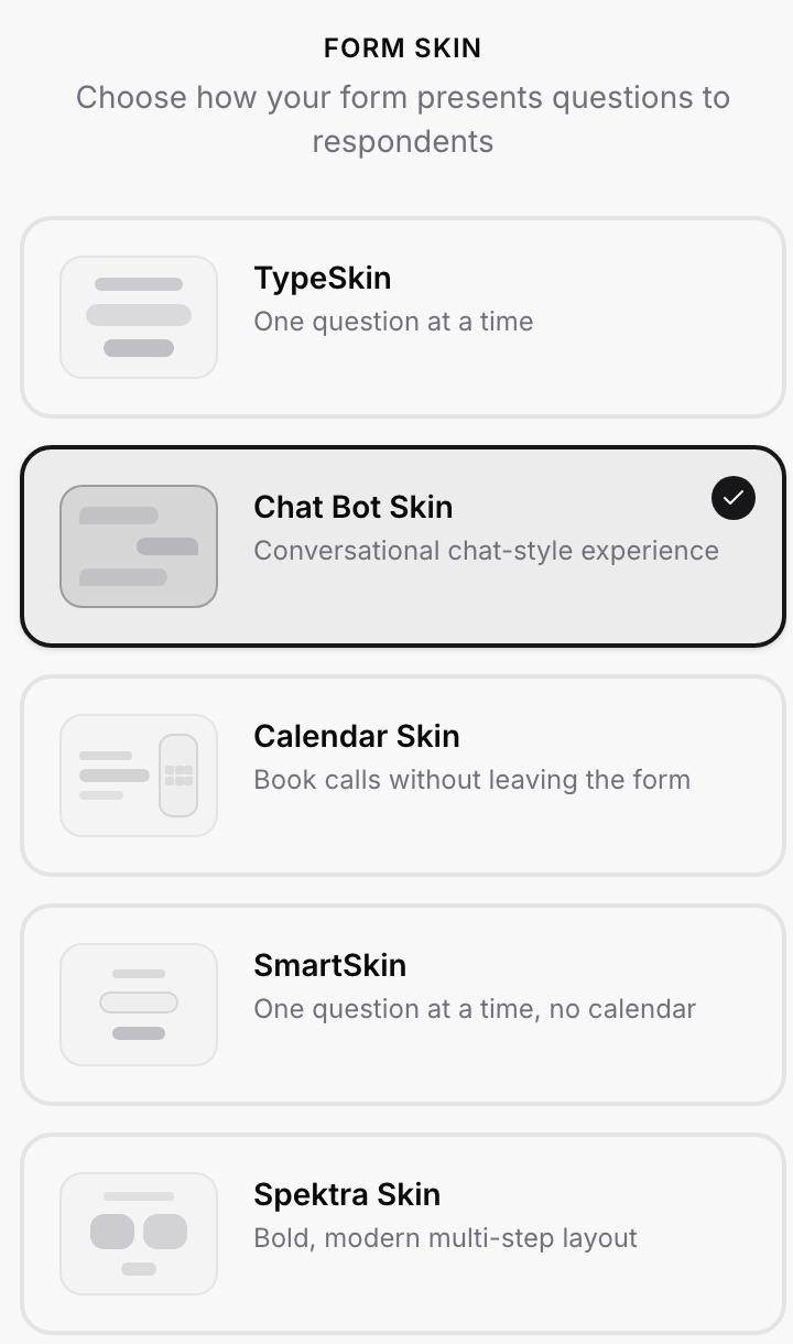
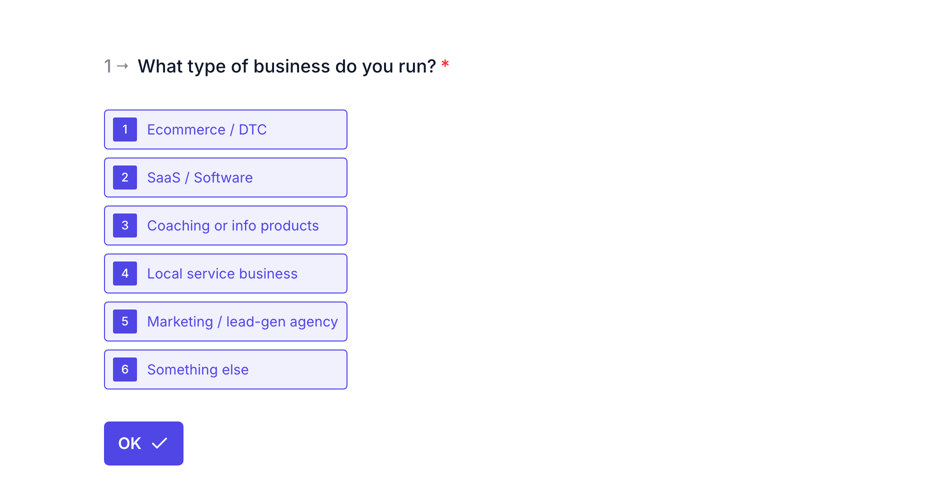
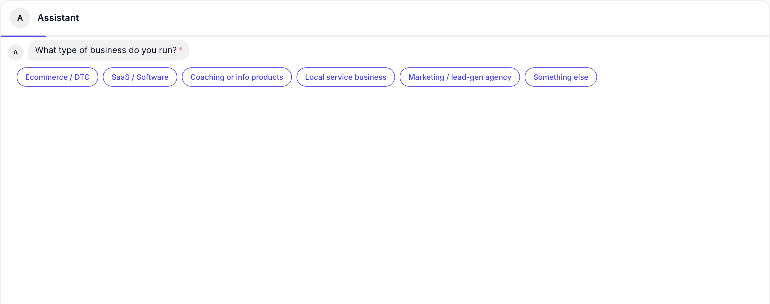
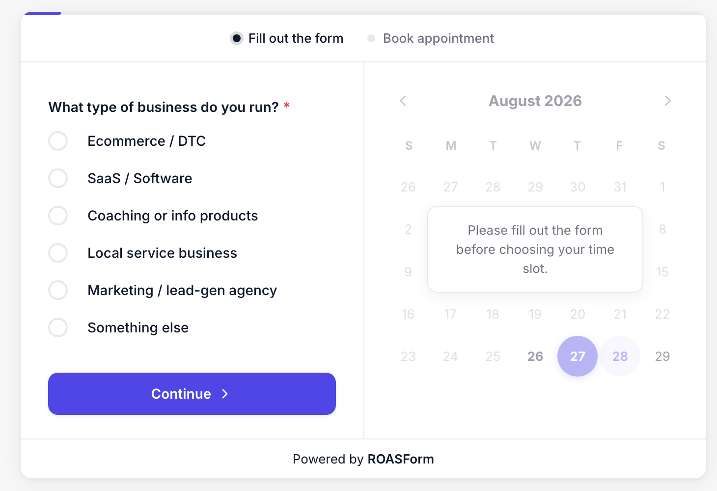
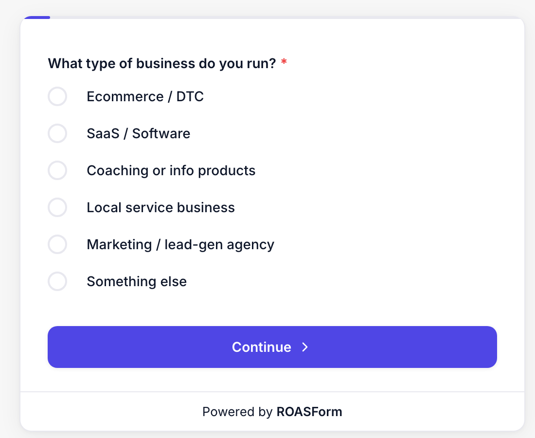
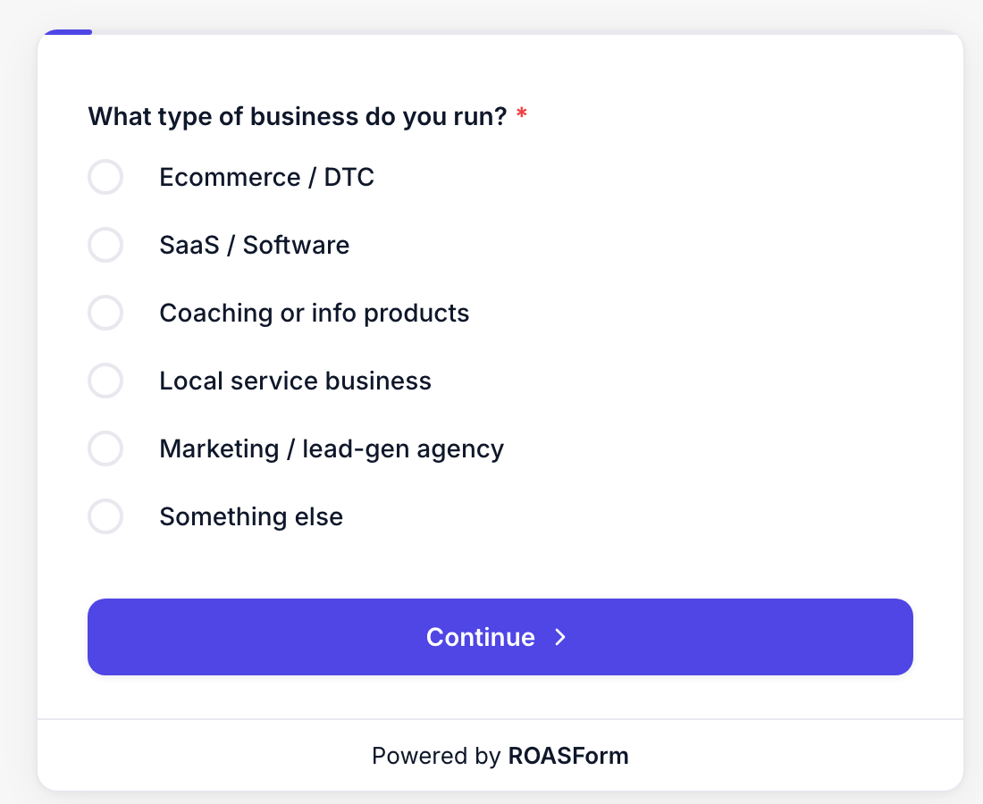
The screenshots below show the same question on every skin.
One question at a time on a full-page canvas: a numbered question, keyboard-friendly options (type 1, 2, 3 or A, B, C to pick, Enter to confirm), an OK button, a thin progress bar at the top, and previous/next arrows at the bottom right. The most familiar "conversational form" feel and the best all-rounder for cold traffic. Use the List style setting on a question to switch the option markers between numbers and letters.
The form runs as a chat. An assistant header with an avatar sits at the top, each question arrives as a message bubble, and options are shown as pills the visitor taps; earlier answers stay in the thread above. Good for support-style or "talk to us" flows where a conversation feels more natural than a form. Full setup in the Chat Bot Form Skin tutorial.
A two-step card built around booking: the left side holds the questions ("Fill out the form"), the right side shows the calendar ("Book appointment"), greyed out with "Please fill out the form before choosing your time slot" until the questions are done. The calendar comes from your GoHighLevel or Calendly Calendar ending, so the form needs one. Best when the whole point of the form is to get a call on the books. Full setup in the Calendar Form Skin tutorial.
One question at a time inside a compact centered card with a Continue button. It is the same flow as TypeSkin in a smaller, self-contained package, which makes it the right pick for embedding in a landing page section or sidebar: the card floats on your page (the embed background is always transparent for it) and does not need the whole screen. It does not include the side-by-side calendar; a Calendar ending still works as a normal step at the end.
A bold, wide multi-step layout: a "Question 1 of 17" counter, a large headline, options in a two-column grid, a centered Continue button, and a progress bar across the top. Made for big screens and high-intent applications where you want each question to feel like its own page. Works best with short option labels so the grid stays tidy.
Open the form and click Design in the top bar.
On the Skin tab, click the skin you want. The canvas updates immediately and the change saves on its own.
Check the preview at desktop, tablet, and phone widths (the toggles above the canvas), then open the live link on a real phone before you send traffic.
Switching back and forth is safe; nothing is lost.
Cold ad traffic, mobile-heavy: TypeSkin or Spektra. One question per screen keeps completion high.
Booking is the goal and you have a calendar: Calendar Skin, so the appointment is visible from the first second.
Embedded inside a page (next to copy, in a sidebar, on a thank-you page): SmartSkin.
Support, intake, or "chat with us" flows: Chat Bot Skin.
If you are unsure, run a split test between two skins on the same questions; see How to Run a Split Test.
Skins are per form. Duplicate a form to try another skin without touching the live one.
Colors and fonts are shared, but a few controls only appear for the skins that use them (for example, the transparent-background option is locked on for card-style skins when embedding; see Embed Settings).
The ROASForm badge shows on every skin on the Free plan; paid plans can remove it under Form Settings.

